If the 5.8" iPhone Pro rumors are to be true, I can see Apple embracing multi-tasking in the form of dockable widgets. Not to be confused with Android's split-screen apps that are literally apps chopped in half, but the ability to dock widget-versions of apps.
In theory, iOS 10's iMessage Stickers should be as popular as Line/WeChat stickers in Asia. In practice, iOS 10's sticker interface is too clunky. I expect a "Favorite Stickers" section and other improvements to encourage better engagement among iMessage users.
I see Apple's new Clips app as a hint for native third-party camera filters for iOS. It will allow third-party developers to create Snapchat-like filters that can be seamlessly added to — and removed from — photos/video directly from the Camera Roll.
Building on my Dockable Widgets prediction that assumes a 5.8" iPhone Pro, I think Apple will finally include picture-in-picture video support for iPhone.
"Apple is No Longer Innovating" →
I think this DJPlayz' opinions are superficial and short-sighted. The whole reason why he argues Apple isn't innovating is because he's focused too narrowly on the iPhone.
First thing's first: how do you define "innovation"? Is innovation about ideas that are cool and exciting? Is it about shipping to market first? Is it about one-upping the competition with better specs each year? Is it about pushing the status quo forward?
I'd argue that innovation is about completely challenging the status quo.
I personally define innovation as: altering the behavior of hundreds of millions of consumers and/or disrupting the way existing companies do business.
With that definition, I'd argue Apple is innovating. A lot. They just do it quietly, either behind-the-scenes, or in such small, incremental steps that the mainstream consumer doesn't pick up on it. Here are a bunch of examples:
- iPhone 7 Plus dual camera — Apple's first public steps into 3D mapping for Augmented Reality and self-driving cars.
- iOS Widgets — With iOS 10, we see Apple breaking down traditional apps into small actionable widgets to not only make interactions with the phone quicker, but make more things possible on a watch. (Yes, Android came out with "widgets" first...but Android Wear has so far failed to get mainstream traction.)
- AirPod's new W1 chip — building on bluetooth technology for longer battery life, quicker connections, improved reliability, and adding the ability to connect one accessory (e.g. AirPods) to multiple devices at the same time.
- AirPods + Siri — laying down the groundwork for a mobile world that doesn't require smartphones. The vision is, someday, people may walk around with a smartwatch & wireless ear buds, and only pull out their smartphones when they really need a screen.
- iOS Health app — In Steve Jobs' final years, he realized how inefficient the health industry is, especially at moving medical records between doctors and facilities. Since he passed away, Apple has hired a team of health industry experts to standardize medical data and transform the whole process.
- Apple Watch — Apple is adding more health sensors to eventually track body vitals 24/7, which is a lot more insightful to doctors than measuring vitals that one day of the year you go in for your check-up. Apple's under-appreciated innovation here is their wide variety of stylish watch straps. When it comes to wearing stuff on the body, real people don't care about tech specs, they care about how it compliments their personal style. It's no coincidence that Android Wear has struggled with female consumers while Fitbit and Apple Watch are succeeding.
- A-series Computer Chips — Apple's most underrated department. Because Apple has full control its own hardware, software, and silicon — in contrast to Android vendors using the same off-the-shelf parts — Apple is in much better position to pack more power into smaller devices. There's a reason why the Apple Watch is the only full-featured smartwatch competing in the 38-millimeter class.
- Apple Watch Edition in ceramic white — Smartphones these days are either made of glass or aluminum casing. Apple is heavily investing in ceramics and material science to make something lighter yet stronger than steel, more radio-friendly, and more luxurious. The new Apple Watch Edition is their first product to use ceramic, which they will use as a learning experience to possibly build hundreds of millions of ceramic-cased iPhones.
- Gold, Rose Gold, Jet Black — Apple is pushing the consumer electronics industry to be more fashionable. Sounds superficial, but there was a time when automobiles all looked like horse carriages. At some point they became personal fashion statements and status symbols. Try picturing the target demographic for people who drive a BMW vs. Cadillac vs. Porsche vs. Prius. We're at that point where consumer electronics is a fashionable expression of how we see ourselves, and I'd argue it's Apple leading that trend.
All of these things are innovations Apple has currently in development. Augmented reality, self-driving cars, revamping the health industry, fashion-forward electronics, building a post-smartphone world…all of these are world-changing ideas that will change the way people live and disrupt the way companies do business.
But these things take time.
So when people say "Apple isn't innovating anymore," I'd argue they're simply focusing too closely on the wrong details, not seeing the big picture, and have the unrealistic expectation that world-changing revolutions happen every 12 months.

How to Fix Home Screen Layout After Restoring iOS Backup →
Sometimes after restoring iOS from a backup, your third-party apps will appear scattered across various screens instead of the folders/screens where you originally placed them.
This tip by Dan Frakes for iOS 4 is still relevant today:
The problem here is that whenever you click the Restore button in iTunes’ Summary view for your iPhone, iPad, or iPod touch, iTunes wipes your device clean, installs a new copy of the iOS software, and then restores your media and settings from your backup. In other words, you’re forcing a first pass each time.
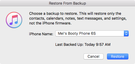
It turns out that iTunes actually offers two kinds of restores. The first is the one described above, accessed by clicking the Restore button in iTunes’ Summary view for your iOS device. The other one is less obvious—you access it by right-clicking (Control-clicking) your iOS device in iTunes’ sidebar and choosing Restore from Backup. As the dialog that appears explains, the latter procedure restores only your data and settings, not the iPhone’s firmware or OS. What the dialog doesn’t note is that your third-party apps apparently remain on the phone, as well. In other words, it gives iTunes that “second pass” at restoring your Home-screen app organization.
The trick, of course—and what I neglected to do during all those restores on Saturday—is to *let iTunes finish syncing your apps** on its first restore/sync. Then you can do the second, non-firmware restore to let iTunes tidy up.
So to break it down, here's what typically happens when you upgrade to a new iPhone:
- connect your new iPhone/iPad to iTunes and restore from your latest backup.
- wait for the restore process to finish and begin the standard sync process. (This is the "first pass")
- important: wait for all third-party apps to sync with the device.
After all third-party apps have been synced and you find them scattered instead of in their proper positions:
- click the Restore Backup button and again, restore from your latest backup. (This is the second pass)
When you Restore Backup from iTunes instead of Restore iPhone, it will clearly state:
This will restore only the contacts, calendars, notes, text messages, and settings, not the iPhone firmware.
It will also restore your home screen folders and layouts, just like before.

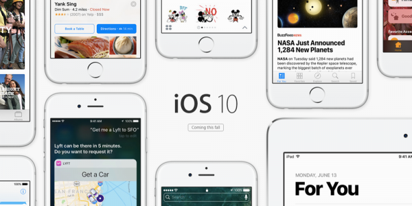
iOS 10: The Little Things
My Favorite Details & Refinements
- You can now delete all those useless stock apps!
- Raise-to-wake! Simply raise up your iPhone (6S or newer) and the screen will turn on. Another one of those features that'll shave a half-second every time you pick up your phone. Really handy for playing/pausing music while driving.
- LOVE the new keyboard sounds.
- Super quick access to the camera! Just raise-to-wake and swipe left.
- In the Camera app, the selfie toggle button is now conveniently located on the bottom-right (previously located on the top-right).
- In iMessage, you can now like and add reactions ("Tapbacks") to specific messages.
- In iMessage, invisible ink and full screen effects are so fun! Simply 3D Touch or Long Press on the Send button.
- In iMessage, links and videos are automatically loaded with thumbnail previews. (You can add invisible ink and other effects to these too!)
- In iMessage, you can drag stickers onto specific messages.
- In iMessage, you can now draw on photos and screenshots. Before sending a picture, tap the thumbnail, tap Markup, doodle as much as you want, hit Save, and send.
- In iMessage, you can enable Read Receipts for specific convos and disable them for all your side bitches.
- In iMessage, you can turn your phone to landscape and the text field will turn into a giant sketch pad.
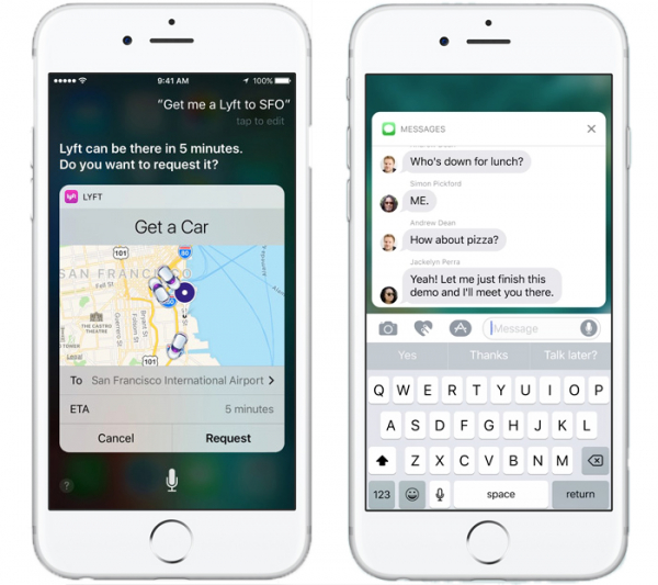
- On an iMessage notification, you can now 3D Touch to peek into the entire conversation.
- The keyboard will suggest emojis while typing.
- If you have a Mac with macOS Sierra, iCloud Desktop actually comes in pretty handy.
- If you activate “Hey Siri” with your voice, it will respond back to you with voice. If you activate Siri by holding the Home button, Siri will respond only on screen.
- When you pause/play music, Album art will subtly change size.
- If your iPhone is almost full and you try to upgrade to iOS 10, it’ll offer to temporarily delete apps, proceed with the upgrade, and then restore the apps when it's done.
- In Apple Maps, destination suggestions will include locations previously viewed in the Yelp app.
- Apple Maps will remember where you parked!
Observations
- The new Raise-to-Wake and Push-Home-to-Open took a week to get used to. (To unlock without having to push the Home button: go to Settings > General > Accessibility > Home Button > Rest Finger to Open)
- The new iMessage apps will totally overshadow the Android-style third-party keyboards.
- The new iMessage will make you hate that one stubborn green bubble person in all your group chats.
- If you send a Tapback or full screen effect to an iOS 9 user, they will receive plain text that says something like, "(Sent with Confetti effect)" or "Mel loved your message 'Lemme touch your butt'".
- If you really dislike someone who has epilepsy, you can send them into a seizure by sending them the lasers full screen effect. (Full screen effects can be disabled under Settings > General > Accessibility > Reduce Motion)
Annoyances
- The new Lock sound is gross. You can disable it under Settings > Sounds > Lock Sound.
- Gestures for notifications & widgets get a little confusing because they look the same. Do you tap it, 3D Touch it, or swipe right on it?
- Switching between a lot of iMessage apps feels a little clunky.
- When you 3D Touch on an iMessage notification to peek into a conversation, it will mark the convo as read (i.e. send out Read Receipts).
Conclusion
The revamped iMessage is a HUGE part of iOS 10. And the best part of it is, everyone will use it, simply because it's there. No app installation needed. No registration required. It'll just work, even for your parents.
iOS 10 also hints at the future — Apple is slowly transitioning us away from the traditional idea of "apps".
Instead of constantly jumping around between apps, we will use extensions and widgets. We will slowly do more and more things from within notifications, iMessage, Siri, Apple Maps, etc.
By breaking traditional apps down into their simplest, smallest actions, not only will this make interactions quicker on the phone…
It will also make more things possible on a watch.

iOS 10: The Future of iOS Apps is Widgets, Extensions →
iDownloadBlog explains that with iOS 10, you can now unlock the iPhone without launching the home screen:
When an iOS device is unlocked, the OS gives apps access to encrypted data.
As a result, launching Camera from the Lock screen of an unlocked device gives you unrestricted access to the whole Photos library as opposed to showing only the images taken during that particular session if you launch Camera from the Lock screen of a locked device.
Here’s another example.
For security reasons, many people prevent Lock screen access for the Notification Center. As much as this great for preventing someone from sniffing around your Notification Center, it’s also a nuisance as reading your incoming alerts requires you to unlock the device.
In addition to these lock screen changes, iOS 10 adds more ways to access apps without launching them individually:
- bring up Siri and interact with richer app widgets
- swipe on the home and lock screens to interact with richer app widgets
- 3D Touch apps on the home screen for widgets and shortcuts
- quickly switch to third-party iMessage apps without leaving the conversation (e.g. send Paypal money to friends)
- perform third-party actions directly within Apple Maps (e.g. book an Uber ride)
These changes show that Apple's once proud, "There's an app for that," tagline is evolving into something different. Since iOS 2, we've thought of the operating system as the platform which you use to launch traditional apps. Now, Apple is turning specific parts of iOS 10 — Siri, iMessage, Apple Maps, Lock Screen, Widget panel, 3D Touch Quick Access — into their own little platforms.
This makes things interesting for app development. Maybe in the future, app developers won't be saying, "I need to create apps for iPhone, iPad, Mac, Apple TV, and Apple Watch ."
Maybe in the future, they'll be saying, "I need to create widgets and extensions for Siri/iMessage/Maps/Music/etc" and everything will simply work on all Apple devices.
Prediction: Fastest iOS Upgrade Adoption Ever →
Yeah. Messages is the most-used app on iOS, period. So, it's used a lot. And certainly, we saw that every time we'd add a couple new emoji, it would be the biggest thing. We work all year on, like, a new file system or something…
And it turns out the rest of the world outside this room was more excited about the two new emoji! So, we figured, y'know, if there's one place we can make a tremendous difference in how people experience iOS fundamentally, they're spending a lot of time in Messages.
And so, we put a ton of creative energy into it, and ultimately, through opening up to developers, I think the collective energy that will go into making Messages great is going to be phenomenal.
I've seen stubborn slow adopters resist software and hardware upgrades until Apple released new emojis and new iPhone colors. And iMessage is one of those features that everybody loves.
This is a no-brainer to me so I'm calling it now — iOS 10 will see the fastest iOS upgrade adoption ever.
Apple's New Subscription-Based Pricing for Apps →
This dramatically changes the economics of the App Store. Until now, productivity apps could charge up front as paid downloads and that was it. Updates had to be free, or, to charge for major new versions, developers would have to play confusing games by making the new version an entirely new app. Twitter clients like Tweetbot and Twitterrific, for example, did this, to justify years of ongoing development. Now, apps like this can instead charge an annual/monthly/etc. subscription fee.
This could be the change that makes the market for professional-caliber iPad apps possible. On the Mac, there has long been a tradition of paying a large amount of money for a pro app, then paying a smaller amount of money for major updates. The App Store has never allowed for that sort of upgrade pricing — but upgrade pricing is what enabled ongoing continuous development of pro software. Paying for each major new version, however, is arguably a relic of the age when software came in physical boxes. Subscription-based pricing — “software as a service (SaaS)” — the modern equivalent. That’s the route both Microsoft and Adobe have taken.
I don't see this affecting most mainstream consumers very much; most people really only use five apps, and those apps are usually the free, popular and cross-platform ones.
But what I am excited about is how this helps power users and productivity apps. Currently, most people would never take a chance on a $20 app. But with the new subscription-based pricing and free trials, that barrier is greatly lowered. Less commitment for consumers and more sustainability for developers.
I'm optimistic about real desktop-class apps coming to iPads and iPhone.