iOS 11's ugly Control Center totally grew on me. I love being able to customize the buttons and no longer having to swipe between Control Center and Now Playing.
Rainforest Garage Demo with ARKit →
Armada Demo with ARKit →
Airplane Demo with ARKit →

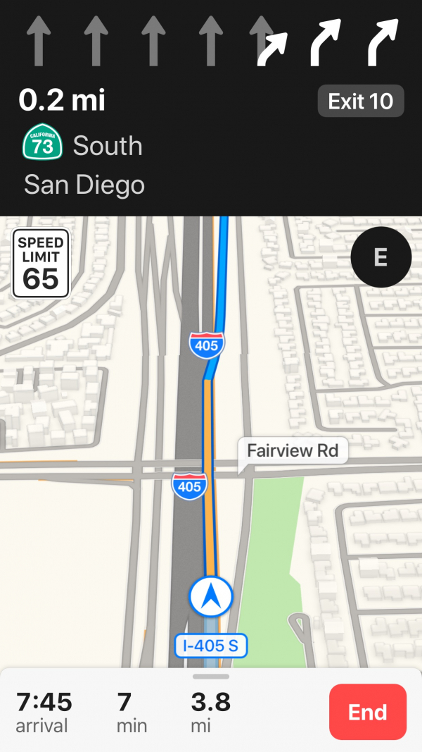
Apple Maps on iOS 11 is pretty good now! Lane Guidance with voice prompts put it on par with Google Maps, feature-wise.
Not sure I fully trust it for random destinations just yet, but Apple Maps just got promoted to my home screen for commutes to work.
Overwatch Character Demo with ARKit →
Zombies with ARKit Demo →
Bike Ride Map Demo with ARKit →
With the iPhone 8 allegedly jumping to 5.8 inches and going bezel-less, they should refresh iOS with interface elements placed closer to the bottom for easier thumb access.