Good products help us do things. Great products change the things we do. Exceptional products change us.
—Horace Dediu
Anytime you think to yourself “The 2.0 update to Product X is great. This should have been 1.0”, you’re probably wrong. You’re not wrong that 1.0 was subpar, you’re wrong on the assumption that 2.0 could have existed without the release of 1.0.
—Erik Person
Instagram Stories →
Here are the similarities between Instagram Stories and Snapchat Stories, broken down nicely by TechCrunch [emphasis by me]:
- The Stories format laces the last 24-hours of 10-second-max photos and videos you’ve shared into a slideshow you can tap to fast-forward through
- Everything you post disappears after 1 day
- You shoot full-screen in the app or upload things from the last 24 hours of your camera roll (recently added to Snapchat with Memories)
- You adorn your photos with drawings, text, and emoji, and swipeable color filters
- You can save your individual Story slides before or after posting them
- Your followers voluntarily tap in to pull your Story and view it, instead of it being pushed into a single feed
- People can swipe up to reply to your Stories, which are delivered through Instagram Direct private messages
- You can see who’s viewed your Story
Here are the differences between the two:
- Instagram Stories appear in a row at the top of the main feed instead of on a separate screen like Snapchat and are sorted by who you interact with most, not purely reverse chronological like Snapchat
- Anyone you allow to follow you on Instagram can see your Instagram Stories though you can also block people, opposed to building a separate network on Snapchat
- You don’t have to be following someone to view their Instagram Stories, which can be viewed from their prolfile as long as they’re public
- You can swipe right or tap the Stories icon in the top left to open the Stories camera, opposed to Snapchat defaulting to the camera
- You can hold the screen to pause a slideshow, or tap the left side to go back a slide, oppose to Snapchat’s time-limited, constantly progressing Stories
- You can’t add old content [older than 24 hours] to Instagram Stories unless you reimport or screenshot, while Snapchat lets you share old Memories with a white border and timestamp around them
- Instagram offers three brush types for drawing: standard, translucent highlighter, and color-outlined neon, opposed to Snapchat’s single brush
- Instagram offers custom color control for drawing with an easy picker as well as pre-made palettes like earth-tones or greyscale, while Snapchat custom color control is much more clumsy
- Instagram currently lacks location filters, native selfie lens filters, stickers, 3D stickers, and speed effects but you can save content from third-party apps like Facebook-owned MSQRD and then share them
- You can’t see who screenshotted your Instagram Story, while Snapchat warns you
- You can’t save your whole day’s Story like on Snapchat, but you can post slides from your Story to the permanent Instagram feed
The emphasized parts are my favorite changes/additions.
I personally love the idea that Instagram now allows for more raw footage like Snapchat, but you still have a little wiggle room to curate. So it might not be 100% raw, but it definitely lowers the standard of "Instagram-worthy" to encourage more sharing on Instagram.
I can see myself using Instagram Stories a lot and then later promoting that one "highlight" shot of the day to my traditional Instagram timeline. It just seems like such a natural and seamless workflow.
Cheers to stealing like an artist but making it your own.
Reducing Friction: The Difference Between Good and Great Design →
And that’s part of the reason why Apple’s “me too”s end up feeling like “me-first”s. In the age of digital, execution is staggeringly important, and there isn’t a single company in existence that can pull off polish and simplicity like Apple. While other companies struggle just to get all of their devices and services talking to one another, Tim Cook and friends are worrying over the details that actually make consumers pay attention. The products don’t just work the way they should; they feel the way they should. Reducing friction, even a single click, can change the way a user perceives an entire product. […] [Emphasis mine]
That’s partly Apple’s magic show: being able to blend the familiar, the known, and the obvious with something (even a little bit) totally new. The company’s senior vice-president of marketing, Phil Schiller, told Businessweek “You can’t just say, ‘Here it is. It does the same thing 5 percent better than last year.’ Nobody cares.” But that five per cent is often the difference between making something that people talk about, and making something they forget. That five per cent is where Apple lives.
Nike Flyease: Sneaker Technology for People with Disabilities →
Love product design stories like this.
When you start looking at a problem and it seems really simple with all these simple solutions, you don't really understand the complexity of the problem. And your solutions are way too oversimplified, and they don't work.
Then you get into the problem, and you see it's really complicated. And you come up with all these convoluted solutions. That's the sort of middle, and that's where most people stop, and the solutions tend to work for a while.
But the really great person will keep on going and find the key, underlying principle of the problem. And come up with a beautiful elegant solution that works.
—Steve Jobs
People Don't Want Something New, They Want the Familiar Done Differently →
Then came the California Roll. While the origin of the famous maki is still contested, its impact is undeniable. The California Roll was made in the USA by combining familiar ingredients in a new way. Rice, avocado, cucumber, sesame seeds, and crab meat — the only ingredient unfamiliar to the average American palate was the barely visible sliver of nori seaweed holding it all together.
The California Roll provided a gateway to discover Japanese cuisine and demand exploded. Over the next few decades sushi restaurants, which were once confined to large coastal cities and almost exclusively served Japanese clientele, suddenly went mainstream. Today, sushi is served in small rural towns, airports, strip malls, and stocked in the deli section of local supermarkets. Americans now consume $2.25 billion of sushi annually.
The lesson of the California Roll is simple — people don’t want something truly new, they want the familiar done differently. Interestingly, this lesson applies just as much to the spread of innovation as it does to tastes in food.
Another great example of innovation being more about execution, not the idea.
Kevin Rose on Focus →
Kevin Rose reiterating my favorite advice.
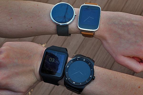
Why Android Wear 1.0 Will Flop →
Here are the Apple Watch dimensions:
- 38 mm model: 38.6 x 33.3 x 10.5 mm
- 42 mm model: 42 x 35.9 x 10.5 mm
And here are some of the dimensions of popular Android Wear devices:
- Asus ZenWatch: 51 x 39.9 x 7.9 ~ 9.4 mm
- LG G Watch R: 53.6 x 46.4 x 9.7 mm
- Moto 360: 46 x 46 x 11.5 mm
- LG G Watch: 46.5 x 37.9 x 9.95 mm
- Sony SmartWatch 3: 51 x 36 x 10 mm
- Samsung Gear Live: 56.4 x 37.9 x 8.9 mm
- Huawei Watch: 42 x 42 x 11.3 mm
Since we're just beginning the Smartwatch 2.0 era and we're waiting to see if smartwatches will gain traction with the mainstream consumer, there are two important questions to ask:
- How many women will wear a smartwatch?
- How many women will pay to wear a smartwatch?
If the answer to the first question isn't favorable (at least a few million), there's no point in even asking about the second one.
So when I look at the dimensions of these Android Wear 1.0 watches, the question comes up: how many women will wear a masculine-looking gadget on their wrist that is over 46 mm?
Apple, on the other hand, has designed a watch in a size suitable for women. Now, I'm not saying that all women will buy an Apple Watch, but I bet there will be a hell of a lot more women in the Apple Watch corner than the Android Wear corner.
Communication by Touch →
This. Exactly this. But built into the Apple Watch.
When Apple first announced communication as one of Apple Watch's three tent pole features, it sounded gimmicky to me. But the more I thought about it, the more I saw beauty in how well it humanizes technology.
This isn't a feature that will wow you when you read about it. This isn't something that will jump out at you when you read tech specs or feature lists. Rather, this is the kind of feature that you may very well fall in love with once you actually experience it. This is about making an emotional connection.